Half a second
The time it takes for a person to form an impression about your organization after landing on your website.
5 seconds
The time you have to engage someone visiting your site, and tell them the mission and goals of your organization.
You may have heard the term "above the fold". This references the content that appears on a website without scrolling down. Examine your content above the fold. Does it grab people's attention? Does your website tell a visually appealing story? Don't rely solely on your own assessment. Survey your donors, advocates, and volunteers to find out if your site works for them. No matter how much you like it, if your website doesn't resonate with your community, they won't engage.
50%+
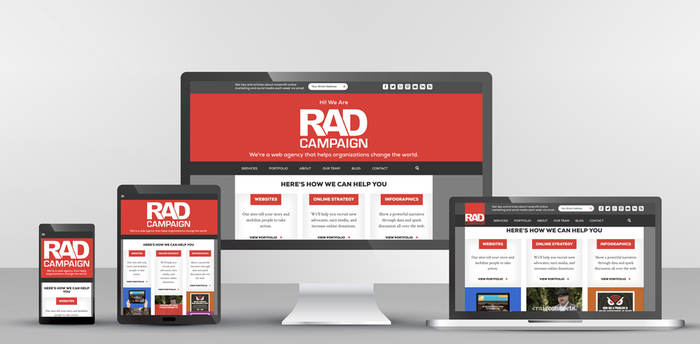
The amount of website traffic that will come from a mobile device. Responsive websites that are designed to include mobile and tablet devices retain more users than websites that only design for computers. Google also punishes a website's SEO (Search Engine Optimization) when they are not mobile friendly.
81%
The percentage of the U.S. population who have social media accounts. Sharing content in bite-sized pieces allow you, as a nonprofit, to quickly and efficiently connect with supporters no matter their location. Incorporate social media buttons on your website along with a strong social media campaign to drive constituents and dollars to your cause. For example, we worked with the Brady Campaign to Prevent Gun Violence by leveraging rapid response campaigns, mobilizing people to tell their Members of Congress enough gun violence and to close the gun loopholes once and for all.
$390 Billion
The amount given to charitable causes in 2016. Ensure your website has a low barrier to entry for donations. Your community may not be able to give much, but every dollar truly counts. Set your minimums low to be as inclusive as possible, and provide donation buttons or CTA’s (calls to action) above the fold in thoughtful locations, highlighted in a way that it stands out.
If users can't easily navigate your website, they will quickly leave. People have an attention span shorter than that of a goldfish, and you can't lose them upon entry. Ensure that your website:
- has a clean, uncluttered design;
- includes an organized site structure and navigation;
- includes clear call to action buttons or links; and
- tells a visual story so you can better connect with your audience.
To sum it up: You need to broadcast the purpose of your organization clearly and quickly on every page. Balance the text with interesting graphics and images, as most users spend more time scanning the website than actually reading content. Confirm that your website is responsive and mobile friendly (that's right, actually test it on various devices). Lastly, incorporate social media throughout your website, paired with a comprehensive social media strategy.
What best practices have you been letting fall to the wayside?


