User Experience Design for Rock the Vote Voter Guide
Rock the Vote has been pioneering innovative ways to make democratic participation more accessible and defending young people’s right to vote. For the 2020 elections, they worked with Rad Campaign to completely redesign the user experience (UX) for their voter guide to help young voters better understand who is running for office and what positions candidates stand for. The voter guide also empowers voters to easily see candidate endorsements from news organizations and advocacy nonprofits that the voter trusts.
To do this Rock the Vote built out large datasets of endorsements for candidates running for office. Included in the database are news organizations, unions, elected officials, nonprofit groups, PACs, and more. The challenge Rad Campaign was presented with was how to design the voter guide to integrate the data in a way that was intuitive and easy-to-use.
Rad Campaign partnered with Rock the Vote to scale one of the largest online voter guides to uplift and empower the biggest, most diverse generation in U.S. history.
Our Solution
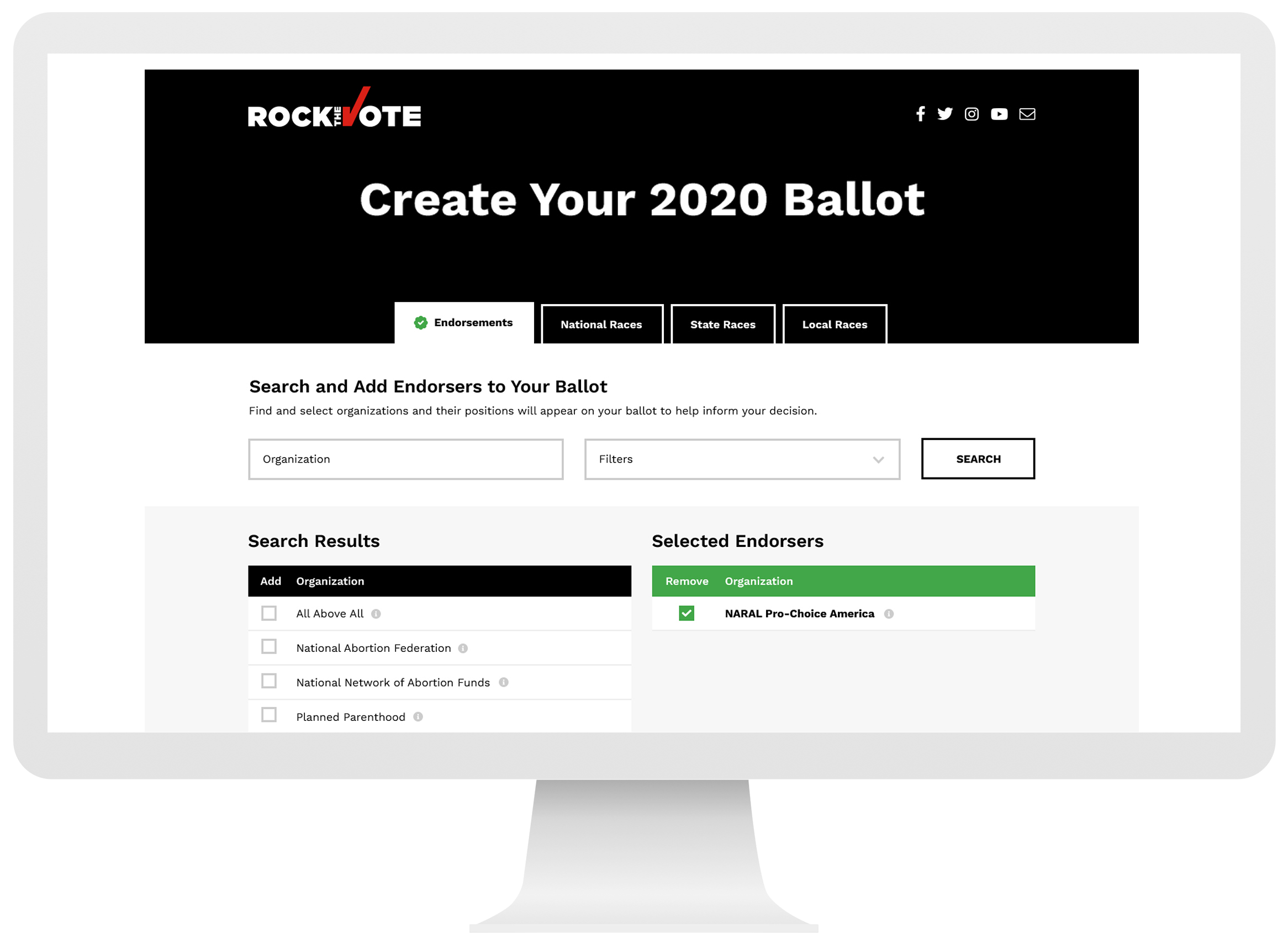
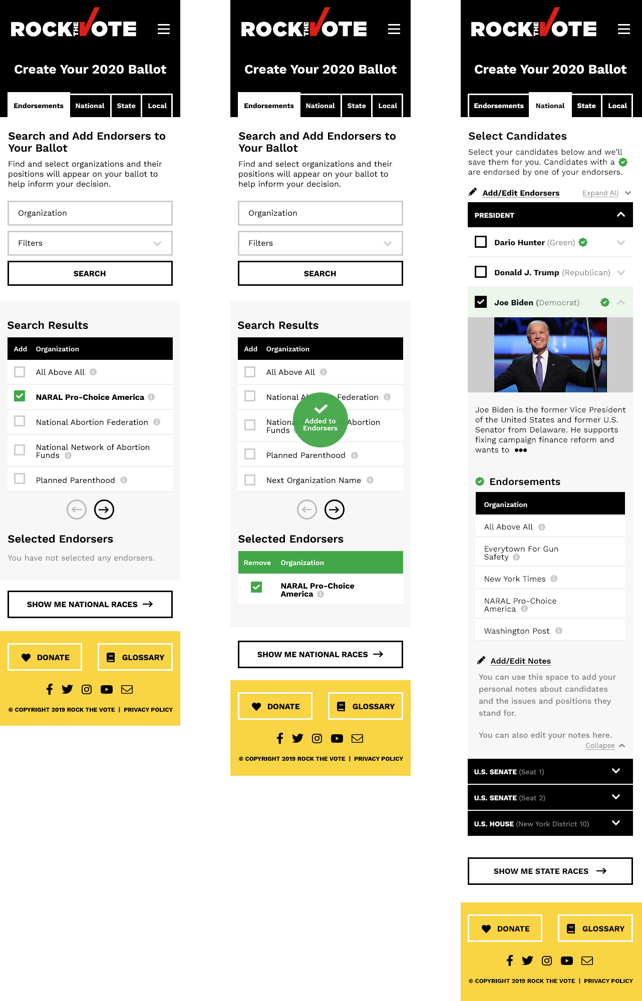
Rad Campaign redesigned the voter guide entirely, focusing on the user experience and creating a "stepped" based approach to interacting with the data. After collecting a user's location, the guide shows all the available endorsement sources for the races the visitor is eligible to vote in. The voter can then pick sources they trust and the endorsements will be presented alongside each candidate in the race. The user can click each endorsement for more information.
The races were divided into different steps as well, National, State, and Local races. Voters can select who they wish to vote for and save their choices as they move through the steps. They can also write notes for themselves in the app, and share their ballot with friends in a variety of ways, including the endorsements they chose to encourage their friends and family to get informed and most importantly, vote!

