We’ve designed and built a lot of websites over the past decade for the largest and smallest nonprofits. Website trends faded in and out, and some came back in style again, and we’ve learned a lot of lessons about how to design websites that mobilize people to take action, boost donations, and advocacy conversions through optimized landing pages.
How can nonprofits supercharge their websites in 2019? Here are eight of the best website trends that you can immediately explore on your own nonprofit’s website.
1. Go Bold
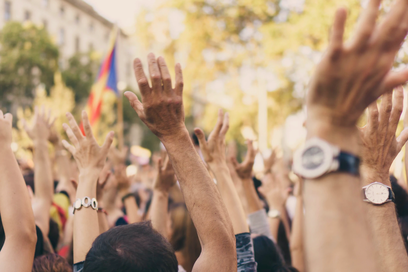
There’s a big debate in the web design community about whether softer and more muted color palettes vs bolder colors will dominate design in 2019. If you are an advocacy nonprofit, go bolder. Given the political climate and upcoming 2020 elections, it’s imperative that you get and hold visitors’ attention. This does not mean every page of your website should be shocking color palettes with no white or lightly colored backgrounds. Instead, use bold colors and graphics that pop to highlight critical content you want users to prioritize or take action on. There are a few ways to do this well, with some of the most effective methods being:
Fundraising Calls-To-Action
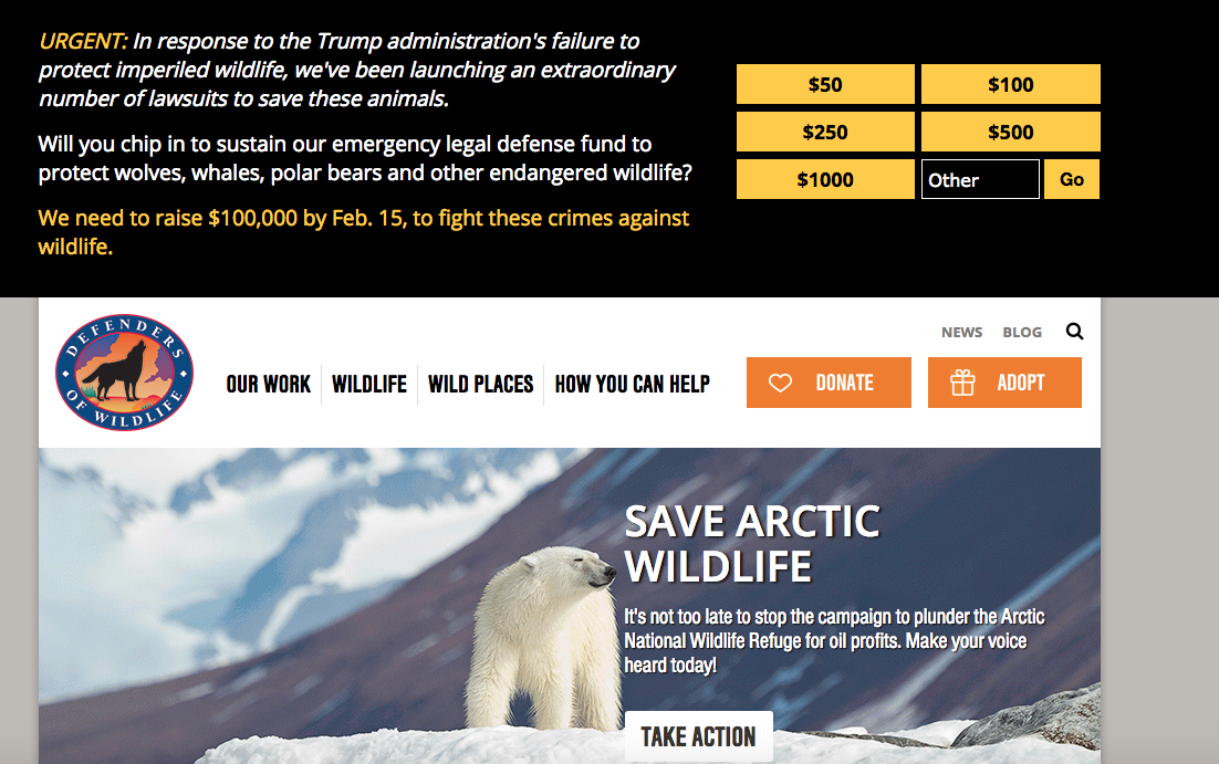
To draw more visibility to Defenders of Wildlife’s legal defense fund and and raise more money to fund their lawsuits against the Trump Administration for failing to protect wildlife, Rad Campaign designed a large and “in your face” call to donate on a black background with bright yellow text using 6 different gift strings. It was placed on every page of the site to reach donor prospects no matter what page of the website they were on. To avoid being too intrusive, the call to action disappeared as users either scrolled down the page or clicked the “X” to close it. The fundraising call to action resulted in a significant increase in donations compared to just promoting a fundraising ask in the homepage hero area.
Hero Images
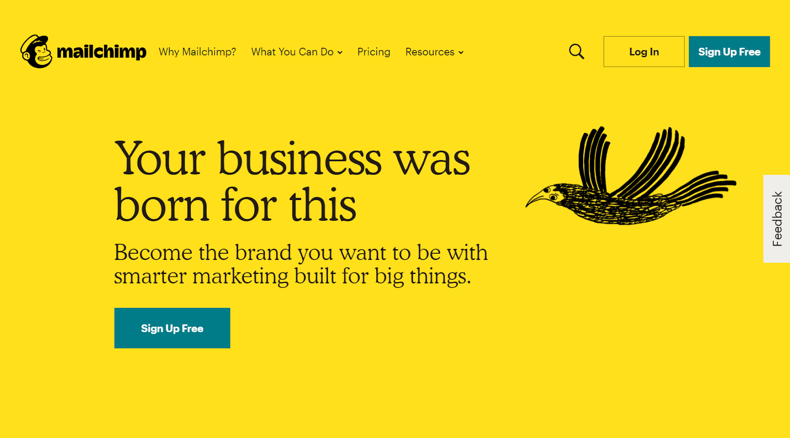
In 2018, Mailchimp re-launched their website with an updated brand to more closely align with their brand voice that’s quirky, fun, and conversational. They now have a bright yellow background with a simple call to action for users to sign up for free on the left-hand side of the site. On the right side, there are smaller, more playful animated illustrations, drawing the user’s attention to the hero content while matching the fun branding that Mailchimp is known for.
In 2019, we will see designers push the boundaries of traditional hero imagery in order to further promote their brand voice, aligning it with one prominent call to action, with the ultimate goal of increasing conversions.
2. Incorporating Micro-interactions
One of the big design elements that keeps people addicted to platforms like Facebook, Twitter, and dating apps are micro-interactions to entice the user. These micro-interactions are where the user takes some sort of action and the website or app reacts to trigger a user response that’s often emotional. For example, every time you are on Facebook and someone comments on your Facebook post, you’re alerted via a beeping sound to prompt you to go and read it. Or, when you check Facebook, you may see a “thumbs up” on your latest post or a red icon showing how many notifications you’ve received. This is done intentionally to trigger a response and, in turn, additional action from the user.
As your nonprofit is thinking about its website redesign in 2019, explore micro-interactions on mouseover buttons and animated effects or sounds to provide instant, positive feedback after a user completes an action on your website. This could be implemented in a variety of ways, including through advocacy actions, donations, uploading photos to a photo contest, sharing a campaign on your website to social media, etc.

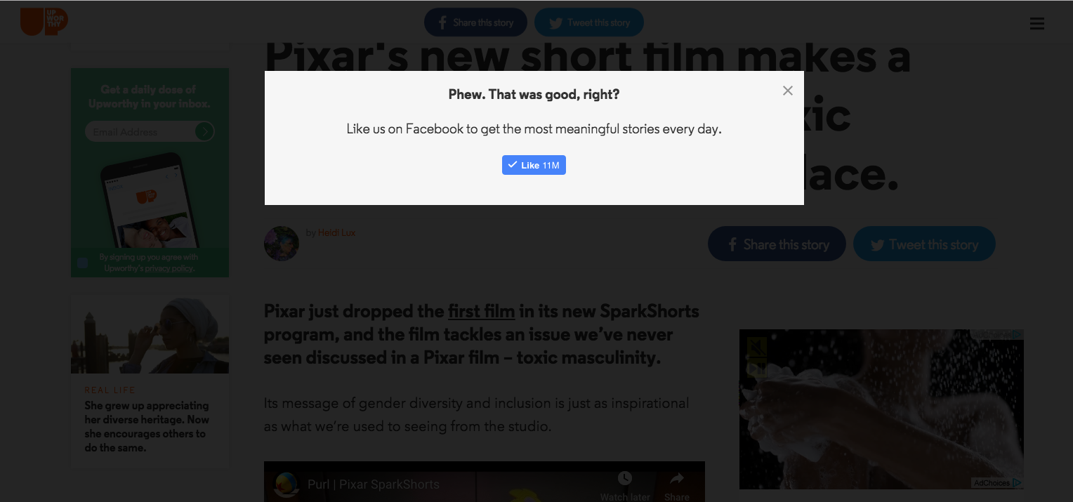
Nonprofits should also consider how micro-interactions can be used to provide tips to your target audiences engaging with your content or data, and encourage them to share your content. For example, after website visitors share a blog post from your website to Facebook, prompt them with a lightbox to “Like” your organization’s page on Facebook. Upworthy does a great job with this type of micro-interaction.
3. The BIGGER the Text, the Better
Do you remember when large hero areas started to dominate nonprofit websites? While they are still widely used, large text on hero images and headlines with creative fonts are also now dominating websites beyond just the homepage hero area. Over the years, designers have felt pigeon-holed by the web, but with advances in web development it’s easier for creative designs to scale across devices and screen sizes. Designers are taking creative freedoms to go bigger and bolder with typography to draw users into key content across website pages.
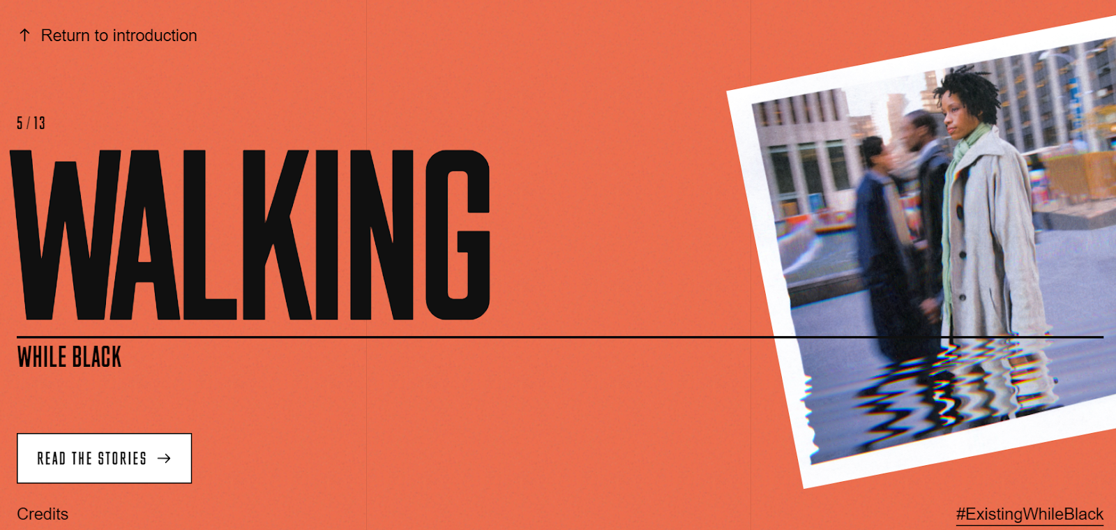
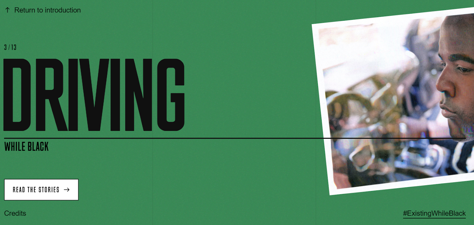
Take a look at the very powerful Existing While Black series on Huffington Post: it’s reflective of a magazine design with large typography treatments and dramatic angled photographic images fading in and out as you scroll down the page.
Body Text
For the copy text in the body of your site, use at least a 16 pixel font. Users find larger body text easier to read since they typically skim content rather than read word for word. Make sure to scale header fonts (h1, h2, etc.) appropriately and establish a “rhythm” with your fonts to increase readability.
4. Massive Calls to Actions
On average, you have 5 seconds to engage someone visiting your nonprofit’s site and in that time, you have to tell them your mission, why they should care, and what they can do to get involved. One key method to hook people quickly is to push them to a prominent call to action that’s timely, deeply connected to your mission, and provides target audiences with something they find very valuable. Many advocacy organizations already use homepage hijacks during year-end fundraising and rapid response campaigns, but they can do a lot more with calls to actions throughout the year focused on the different ways their constituency can make an impact.
Kamala Harris’ 2020 presidential website is a terrific example of having large calls to action integrated throughout the site. On the homepage, website visitors immediately see Harris’ stance as “Tough, Principled, Fearless.” Then, off to the right, visitors are prompted by a large callout to sign up to her email list.

Scroll down the page and there’s a succinct call to donate in an honest and authentic voice.
“No corporate PACs—just people, like you! We don't have to accept a system that drowns out your voice. We can do better. Donate now.”
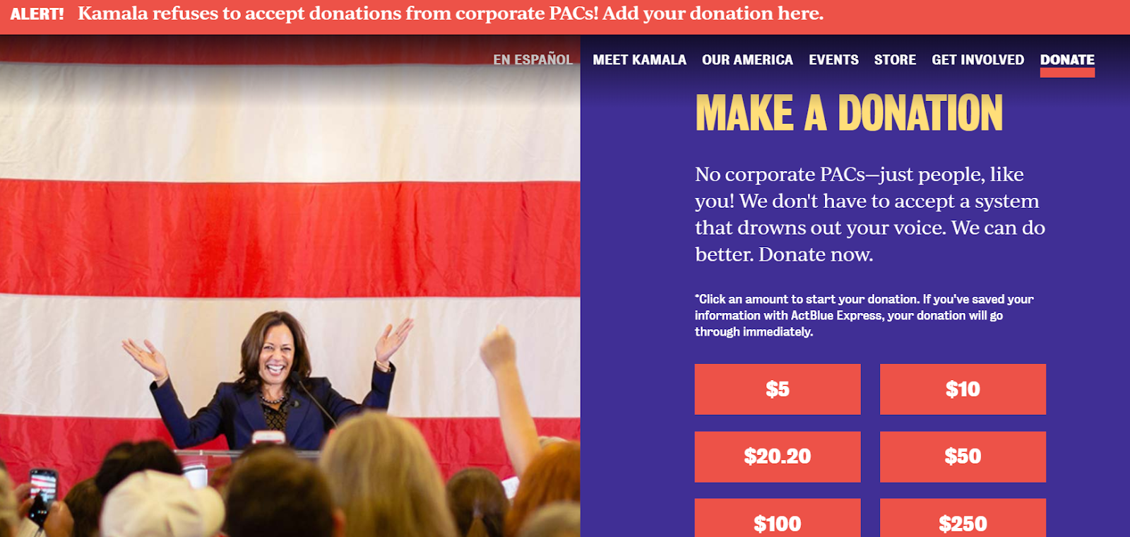
This prominent call to donate is impossible to miss.
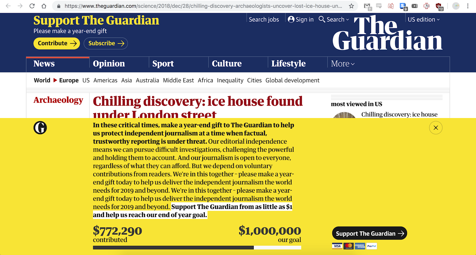
The Guardian integrates large calls to donate into their biggest news articles on their website at certain times during the year. They leverage bold colors and large text that conveys how The Guardian is one of the only independent news organizations left at a time when trustworthy journalism is being threatened. They highlight that their journalism is open to everyone regardless of their ability to pay for a subscription. And, they make a compelling case to donate by being transparent about where they are in their fundraising goals to help keep The Guardian’s doors open.
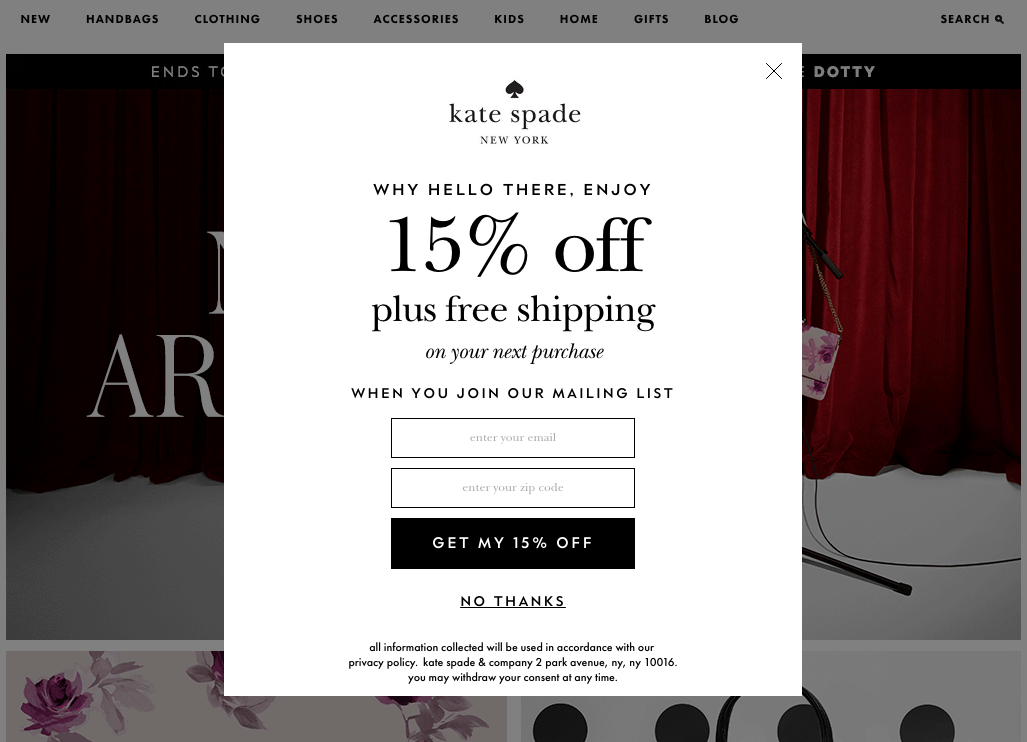
Massive calls to action aren’t the only effective way for organizations to solicit donations. For example, organizations that have ecommerce stores, like the Human Rights Campaign (HRC) or World Wildlife Fund (WWF), can increase conversions by adding large email signup popups offering 15% discount codes when users provide their name and email address. The user finds the 15% discount valuable and, in turn, are happy to provide their name and email address. The biggest retailers use this strategy because it converts people. Nonprofits can easily adapt this strategy too.
Here's a great example by Kate Spade.
5. Chatbots
Most nonprofits aren’t using chatbots as part of their arsenal of communications tools yet, but it’s something nonprofits should consider to test if it’s a good fit.
For example, chatbots could be helpful if your organization has a dedicated customer support staff for an ecommerce store, program, or service people use or pay for. In these cases, chatbots can automate customer support functions for most FAQ or queries. For more complicated queries, the chatbot could direct these questions to the appropriate customer support team for follow up.
For example, Planned Parenthood recently rolled out Roo, their chatbot targeting 13-17 year-olds. It’s intentionally gender-agnostic and allows people to privately ask questions that they may find embarrassing. The topics range from health to relationships to getting care at a local Planned Parenthood, etc. It’s an extension of the Planned Parenthood’s support team, providing a safer space to get answers from health experts.
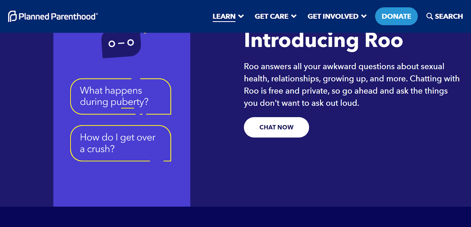
The more users interact with Roo, the more the chatbot learns; Planned Parenthood will be able to use this data to add more topics, and expand their content. Planned Parenthood has had over 50,000 conversations since it launched one month ago.
It’s worth noting that the chatbot market is still maturing and users can easily and unintentionally trip up the chatbot, sending people into an endless loop, providing a poor user experience.
For example, when Rad Campaign was testing a highly trafficked chatbot recently and going through a basic Q&A, we responded “thanks” after the bot provided a link to a resource. When we responded “thanks,” we received the following response back: “Sorry, I don’t understand your response.” It was a bizarre user experience and clearly shows how the bot was never programmed to account for the user thanking them for providing a link to a resource. Bots also don’t understand human nuances yet, so while they can be helpful, don’t look to them to replace humans.
6. Personalization
You don’t have to be Amazon to take advantage of website personalization. Nonprofits can also tailor their website to deliver personalized content to their donors, advocates, volunteers, and the media. Personalization can lead to increased time spent on websites and, ultimately, more donation and advocacy conversions.
Here are a few ways nonprofits can leverage personalization on their websites:
Location
Nonprofits can pull in location data based on the website visitor’s browser. By pulling this data in, nonprofits can serve up timely and local content such as local events and rallies that people can RSVP to attend. Further, if your nonprofit works on local advocacy campaigns, you can pull in local advocacy actions or pledges that people can sign onto.
The key to leveraging website personalization is to identify the local content that your nonprofit is able to provide for your target audiences. For example, on a prominent Jewish organization’s website that Rad Campaign is currently building in Drupal 8, we’re providing each website visitor with the location of their nearest synagogue. This is a simple way to convert constituents from online to offline actions, and move them up the ladder of engagement.
ECRM Data
For nonprofits that have the budget and dedicated content teams, you can drill down even further by leveraging users’ ECRM data. For example, you can serve up personalized website content according to advocacy actions and campaigns that each web visitor donated on. This could be useful for organizations, like the ACLU, who work on several issues. The ACLU, for example, has 18 issues in their dropdown menu. Not everyone visiting their website is going to be interested in seeing content related to all 18 issues, so integrating more personalization for their website audiences could increase engagement and increase conversions.
Predictive Recommendations
There’s a reason why Amazon is the most successful ecommerce website. They’ve perfected predictive personalization through “If you like this, you might also like…” It’s been reported that predictive personalization accounts for 35% of their sales.
Nonprofits can leverage predictive personalization via users’ search history on your nonprofits website, popup surveys where users checkoff their interests related to your nonprofit's mission, etc.
While personalization can be helpful in providing the best content to your target audiences based on their personal preferences, it does come with a cost. First, it can be expensive to build different levels of personalization into your website. Second, personalized content can require a steady stream of new content being developed and published on a regular basis as website visitors will expect to see new content and advocacy and donation opportunities each time they visit your website. You’ll need to determine whether your nonprofit has the capacity to curate this type of personalization.
7. Video and Podcast Content Rules
In addition to providing another way for constituents and the media to consume your content, depending on their viewing preferences, Google is now featuring search page results with video content higher than standard web pages that don’t integrate video. Nonprofits have access to some of the most incredible and impactful stories on some of toughest issues facing this world. Staff should be empowered to tell these stories through multiple mediums, including podcasts and video.
Mark Horvath, founder of the nonprofit Invisible People, recently launched the organization’s new website to be positioned as the Buzzfeed or Vice on the topic of homelessness and how to to end it. Horvath, who operates on a lean budget, has found success in focusing the organization’s content on video and has seen an increase in donations as a direct result.
“I have learned there is a direct correlation between the number of views and increase in online donations,” said Horvath.
He also recommends that nonprofits test longer form video content.
“There is a myth that video must be short because we live in a world where everyone has a short attention span, yet people now burst their bladders binge-watching Netflix. If all of your content is short, then you are missing an opportunity to get more people to watch your videos.”
8. Social Proof
Airbnb, Amazon, and Yelp all rely on social proof to help their audiences make decisions based on the experiences other users have shared. To put this in marketing terms, social proof is a tactic to optimize conversion rates.
There are a variety of ways nonprofits can use social proof on their websites to build more trust with their audiences, such as:
- The Customers - Integrate ratings and reviews into your ecommerce store to encourage people to make that purchase and seal the deal. Studies have shown that nearly 70% of American shoppers sought out reviews before making a purchase online.
- The Community - Highlight the number of advocates, donors, and volunteers who have joined your nonprofit to support your mission.
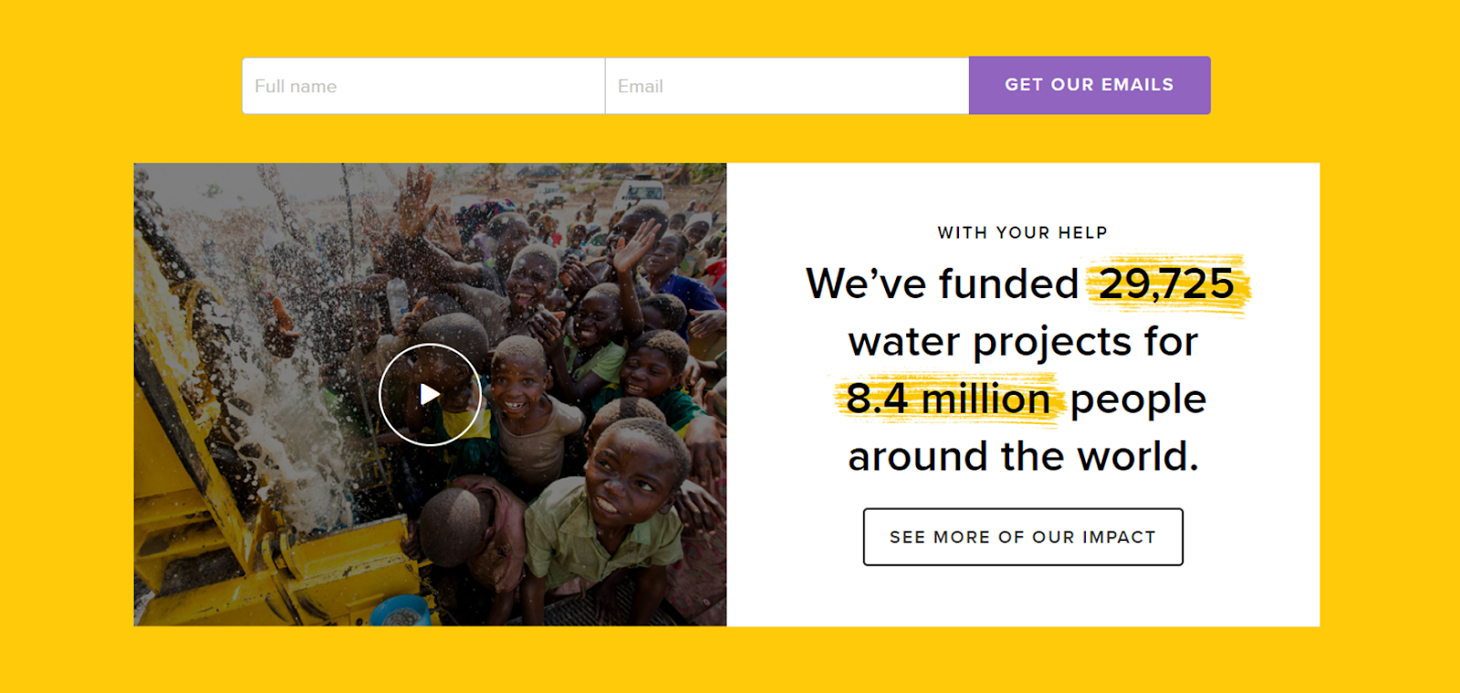
- The Impact - Illustrate how your nonprofit has made an impact on the community you serve. For example, charity: water has been consistently transparent about sharing their data and their mission to bring clean, safe drinking water to every person on the planet. To date, they’ve raised $330 million to fund more than 29,000 projects in 26 countries that serve more than 8.4 million people with clean water.
- The Certifications - Showcase your nonprofit’s trustworthiness via third party certifications such as the Charity Navigator and Guidestar ratings and seals of approval. These ratings are very important to some donors, foundations, and philanthropists when they are making a decision to donate to your nonprofit.
Next Steps
What website challenges is your nonprofit facing? How can Rad Campaign help you solve those pain points? Which of these trends do you think would work best for your nonprofit? Drop us a line.